

Context
Role
Sole product designer
Team
Cross-functional team up to 20 members, including service designers and developers
Client
A UK public sector organisation
Phase
Beta & Live (MVP delivery)
Timeline
12 months
Ownership
Led the product design for the end-to-end experience
Note
Due to NDA constraints, the organisation name has been anonymised and original deliverables are not shown.
Summary
The problem
A UK public sector organisation needed to build an MVP for a digital licensing service that could support different application types and complex regulatory requirements.
The challenge
Making a complex application process feel simple while keeping it compliant with WCAG.
What we did
We started with the research and existing forms to shape the information architecture. From there, we worked closely with SMEs, using GOV.UK patterns, coded prototypes and user testing to refine the service.
What we produced
A digital licensing service with a highly conditional application form, reusable design patterns, and a scalable foundation for future improvements.
The result
A simpler application process, a more consistent user experience, and a solid foundation for future development.

The challenge
Making a complex, data heavy process easier to navigate
A public sector organisation needed a digital service for applying for licences. Previously, applications were completed and reviewed entirely through Word forms, making the experience slow and inefficient.
The process is highly regulated and data heavy, with complex rules and application routes that vary depending on the activity being carried out and the type of applicant.
The new service also needed to fit within the organisation's wider design system which is based on the GOV.UK design system and scale consistently across hundreds of existing and future forms.
The approach
Start with what we know, then challenge it
Our approach was grounded by what already existed:
Build on what we already knew
reviewed the discovery research to understand the needs, constraints and findings that had already been uncovered.
Create a steady design rhythm
set up four design crits per sprint so we could continuously discuss and test ideas with SMEs across a highly regulated process.
Make sense of the Word forms
analysed the existing Word forms in detail and used them as a starting point for the information architecture.

The process
Breaking complexity down, one problem at a time
01
Applications could take months to complete

Problem
Users could take months to complete their application and would need to return to it several times. They needed a clear way to understand what they had already completed, where they had left off and what was still to do.
Solution
We used the task list pattern to break the application into manageable sections and clearly show the status of each task. At the end of each task, a check your answers page let users review and change the information they had provided.
This gave users a clear sense of progress and made it easier to return to an application and pick up where they left off.

02
Users need to provide similar information multiple times
Add another pattern

Problem
Some applications required users to provide details about multiple items, people or activities. Each one required a specific set of information, so users couldn't simply provide a list in a single text field. The number of entries could also vary.
Solution
We used the add another pattern when users only needed to provide the same information a few times.
When users needed to add a larger or unknown number of entries, we used the add to a list pattern instead. This allowed us to collect the specific information needed for each entry while giving users a clearer way to manage larger lists.
Add to a list pattern

03
Too much information at the wrong time
Problem
Users could be shown questions and information that weren't relevant to their application. In a process that was already highly regulated and data heavy, seeing unnecessary questions could make the journey feel even more overwhelming.
Solution
We used conditional logic to show users only the questions that were relevant to them. This meant they didn't have to navigate complex journeys or work through sections that didn't apply to their application.
What the product team saw

What engineering saw
ORGANISATION, NO CONSULTANT
IF user.type = "organisation"
AND SCREEN_02 = "No"
→ SCREEN_03
→ SCREEN_05
// SCREEN_04 skipped
IF SCREEN_03 = "Yes"
→ DECLARATION_A
ELSE
→ DECLARATION_B
INDIVIDUAL, NO CONSULTANT
IF user.type = "individual"
AND SCREEN_02 = "No"
→ SCREEN_05
→ DECLARATION_A
// SCREEN_03, SCREEN_04 skipped
CONSULTANT
IF user.type = "organisation" OR "individual"
AND SCREEN_02 = "Yes"
→ SCREEN_04
→ SCREEN_05
→ DECLARATION_B
// SCREEN_03 skipped
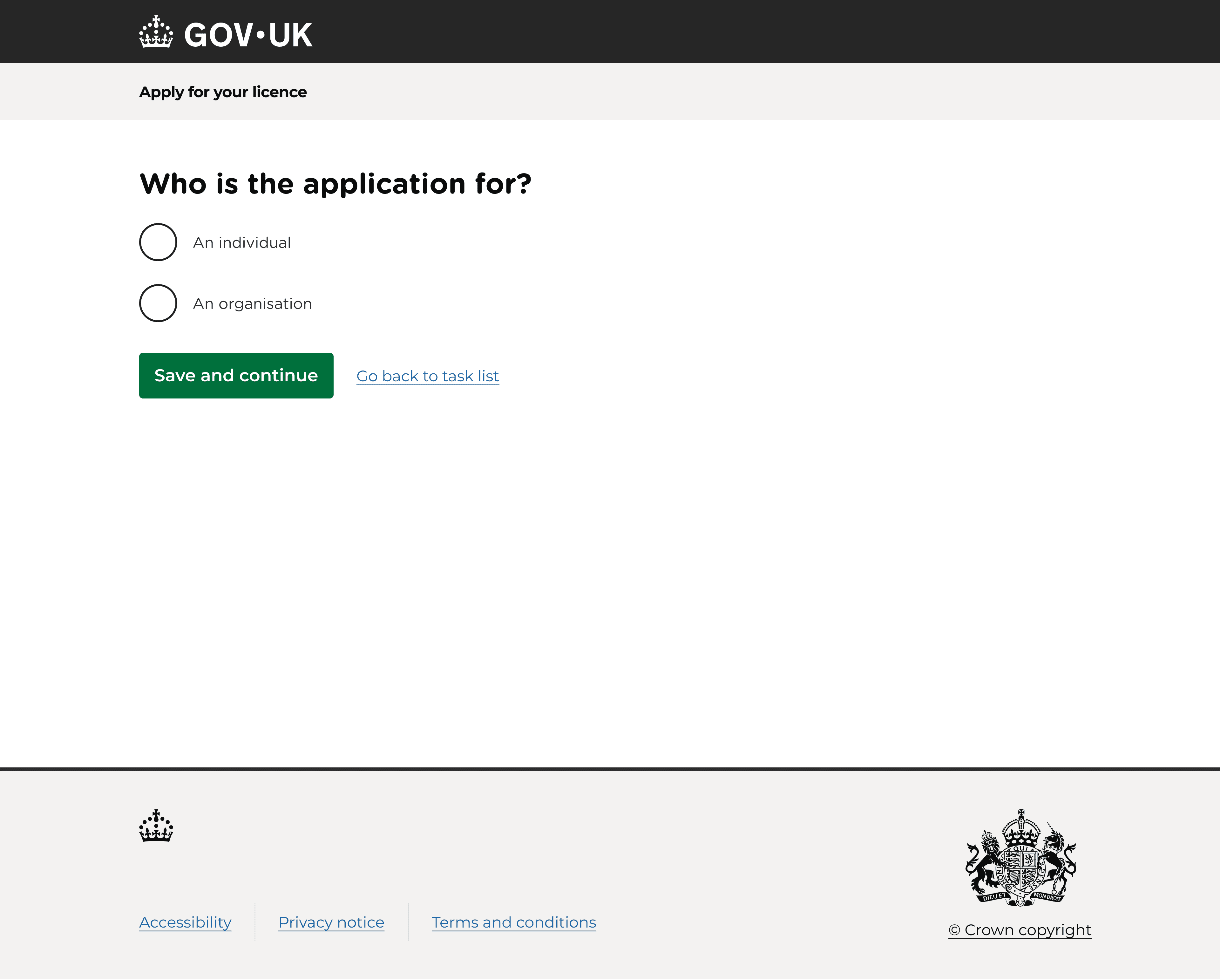
What the user sees


The final design
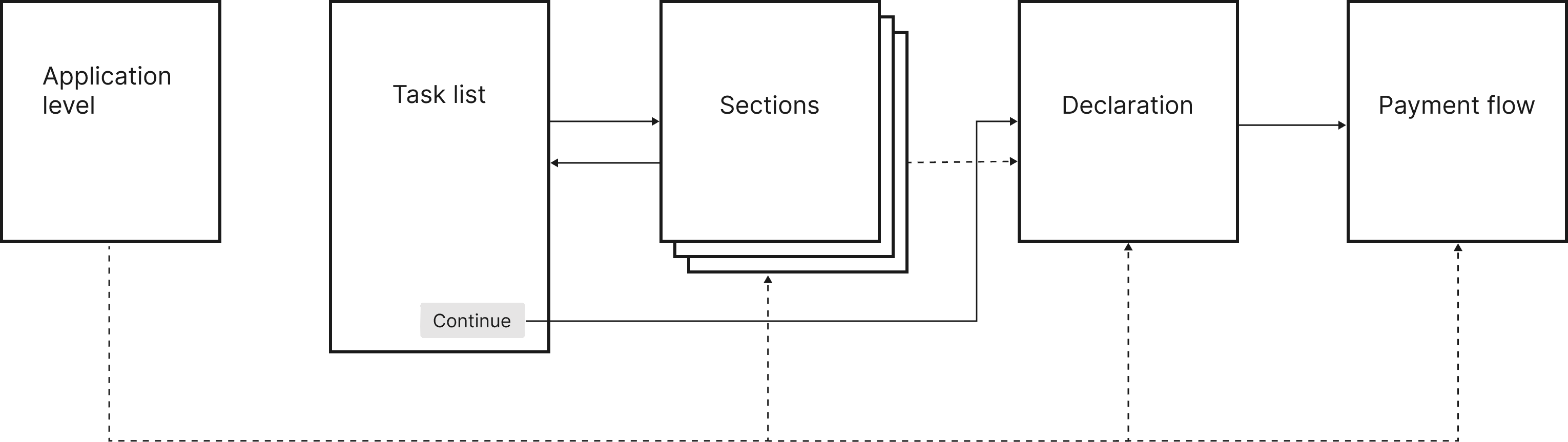
One service, many journeys

A digital licensing service designed to make complex applications easier to complete.
The service uses task lists to help users keep track of their progress, list patterns to collect repeated information, and complex conditional logic to show only what’s relevant to each user.



Reflections
A few key learnings and limitations stood out
Learnings
Dissect the existing forms early
Workshopping the original forms early helps uncover hidden rules, questions and complexity.
Discovery cannot capture everything
Some ecosystems need a deeper dive once design has started. Be prepared to pause some of the design work to understand them properly.
Specialisms help manage complexity
On complex products, the right information needs to sit with the right people. Clear ownership across content, design, product and BAs helps maintain oversight.
Communication needs to be deliberate
On intense projects, information can easily get lost. Repeat key messages and document decisions clearly so people can find them later.
Limitations
Technical constraints
The software was good for conditional forms, but simple customisations often took developers a long time. This added overhead and made it harder to work at an agile pace.
User research constraints
Our small participant pool meant we had to be deliberate about what and when we tested. NDAs also limited our options for recruiting more widely.
Complex governance
Working across many SMEs, dependencies and approvals significantly slowed delivery. Looking at these processes through a service design lens could help identify unnecessary handoffs and bottlenecks.